Blog 16 - Portraits
Since I already "paint" so much in photoshop, I decided to play around with more of the layer effects and some tutorials seemed too fun to pass.
For my portrait, I followed the pop art tutorial since the combination of cutouts with the edges gave off a cool effect. My image could have been better for color levels but I think it turned out alright.
For the portrait of someone I know, I took a picture of my boyfriend I had and followed the lego tutorial. I'm actually really excited to now know how to make easy photoshop patterns from this.
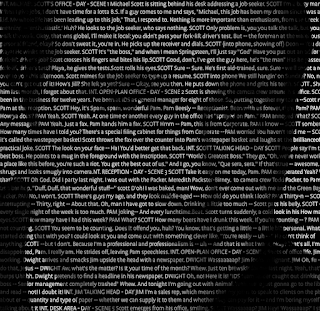
And for the portrait that was up to me... I really didn't know what to do at first. So on a whim, I chose the dramatic text blend tutorial. I present to you: a photo of Michael Scott made from the script of The Pilot, the first episode of the office.


Comments
Post a Comment